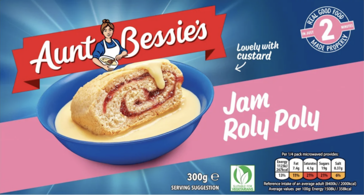
For more than 30 years, Aunt Bessie has been a familiar face in supermarket freezer aisles, smiling out from packets of Yorkshire puddings and roast potatoes. Now, the much-loved character has been given a major makeover, and the version shoppers grew up with is being replaced. The new look has divided opinion, with some welcoming the change and others sad to see the old Bessie go.
Aunt Bessie’s first launched in 1995 and quickly became a go-to brand for anyone wanting a roast without the fuss. It’s best known for its frozen Yorkshire puddings, which have found their way onto countless Sunday dinner plates. Over the years, the range has grown to include roast potatoes, vegetables, stuffing and much more.
At the heart of it all has been the character herself. The cheerful, grandmotherly figure holding a mixing bowl and spoon has become something of a national treasure. For many families, she’s as much a part of a roast dinner as the gravy.
It’s the biggest change in the brand’s history.
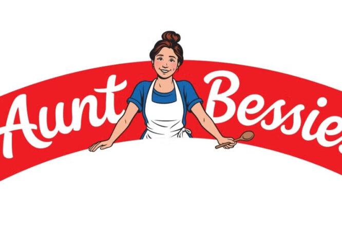
The company has made small tweaks to its logo over the years, but this update is said to be the biggest since the brand began. Aunt Bessie has been given what’s being called a glow-up, with a fresher, more modern appearance. Her wrinkles have been smoothed away and her trusty mixing bowl has gone.
The new design is meant to feel warmer and more welcoming. She now sits in the middle of each pack, looking as though she’s serving the food to you personally. The redesigned packaging is already starting to appear in shops across the UK.
View this post on Instagram
One of the most noticeable changes is what Aunt Bessie is doing. Instead of being shown mid-bake, she’s now pictured with her arms open, ready to dish up Yorkshire puddings, roast potatoes and honey-glazed parsnips. She’s gone from busy cook to welcoming host.
The old image of her mixing ingredients suggested years of experience and homemade cooking. The new version is more about bringing people together around the table. It’s a subtle difference, but one that changes the feeling behind the brand.
Why the brand decided to change
Aunt Bessie’s says the update reflects how the nation’s eating habits are changing. Roast dinners are no longer saved just for Sundays, and many people now enjoy them on any day of the week. According to the brand, four in ten Brits cook Yorkshire puddings whenever they fancy them.
A more modern look could help the brand appeal to younger shoppers and fit in with these new habits. The company insists that, despite the fresh appearance, she’s still the same Aunt Bessie families know and trust. The products inside the packets haven’t changed, only the face on the front.
The brand is taking a risk as well as a refresh.
Marketing specialists say changing such a well-known character always comes with some risk. Familiar faces on packaging help shoppers feel comfortable and confident about what they’re buying. Updating that image can make a brand feel more current, but it can also chip away at the sense of trust built up over many years.
The move from cook to host makes sense if people are eating roast dinners in different ways. It could help the brand break free from its traditional Sunday lunch image. The trade-off is that some customers may miss the reassuring, homely figure they’ve known for decades.
@d_maude She had a glow-up 😂 filthy bunch online 😬 Aunt Bessie’s Has Had a GLOW UP 👀🔥 #AuntBessies #GlowUp #filthy #FoodTok #loveit ♬ original sound – Dan de man
Fans have mixed feelings about Aunt Bessie’s new look.
Reaction online has been split. Some shoppers are disappointed, saying they feel the classic grandmotherly character has been pushed aside for a younger version. A few have argued it sends the wrong message about ageing, suggesting older faces should be celebrated rather than updated.
Others have welcomed the change, describing the new design as brilliant and eye-catching. Some think a fresher look was long overdue and will help the brand stand out in busy freezer aisles. Plenty of people have also said that, as long as the Yorkshire puddings taste the same, they’re happy either way.
It’s not the only brand to update its image.
Aunt Bessie’s isn’t alone in giving a familiar character a modern twist. Lots of long-running food brands have refreshed their mascots and packaging over the years to keep up with changing tastes. Some updates are barely noticed, while others spark strong feelings among loyal customers.
Characters on packaging often become linked with childhood memories and family traditions. That’s why even small changes can feel surprisingly personal. It usually takes a little while for shoppers to get used to a new look before it starts to feel familiar.
If you’re a regular buyer, don’t be surprised if your usual packets look a little different next time you visit the supermarket. The products themselves remain the same, so there’s no need to change how you cook them. Keep an eye out for the updated design so you can spot your favourites quickly in the freezer aisle.
You might find a mix of old and new packaging on shelves for a while as stock is replaced. If you’re fond of the original look, now could be a good time to take a final glance before it disappears. Either way, your roast dinner should taste just as good as ever.